Surface Conditions

KAN_B KAN_L KAN_M KAN_U KPC_L KPC_U MIT NUK_K NUK_L NUK_U QAS_U QAS_M QAS_L SCO_L SCO_U TAS_L TAS_A THU_L THU_U CEN EGP UPE_L UPE_U ZAK_M promice.org runoff

PLEASE MAKE SURE TO READ THE TEXT BELOW!

The map illustrates how the surface of the Greenland Ice Sheet gains and loses mass on a daily basis. This difference between snowfall and runoff is known as the SURFACE mass balance It is always positive over the course of a year as not all fallen snow runs off the ice sheet again.

The surface mass balance is NOT identical to the TOTAL mass balance (i.e. overall gain or loss of the ice cap), which also includes the mass that is lost when glaciers calve off icebergs, the melting of glacier tongues as they come into contact with warm seawater and frictional and other effects at the bottom of the ice sheet.

By holding the mouse over the black circles, you can see the day’s weather observations from meteorological stations that are used to monitor the melting processes.

We have technical problem with showing the PROMICE observations.

By clicking on the magenta circle, measurements of runoff from Watson river close to Kangerlussuaq is shown. The river drains about 12000 km2 of the inland ice.

The graph below the map shows the total daily contribution from all points on the ice sheet.

The blue curve shows the current and the light grey curve the previous season’s surface mass balance measured in gigatonnes (1 Gt is 1 billion tonnes and corresponds to 1 cubic kilometre of water).

The dark grey curve traces the mean value from the period 1981-2010.

The light grey band shows differences from year to year. For any calendar day, the band shows the range over the 30 years (in the period 1981-2010), however with the lowest and highest values for each day omitted.

Read more.


PLEASE MAKE SURE TO READ THIS TEXT!

The map illustrates what the ice sheet’s SURFACE gains and losses have been over the "mass balance year" since 1 September compared to the period 1981-2010. This surface mass balance is always positive over the course of a year as not all fallen snow runs off the ice sheet again.

The surface mass balance is NOT identical to the TOTAL mass balance (i.e. overall gain or loss of the ice cap), which also includes the mass that is lost when glaciers calve off icebergs, the melting of glacier tongues as they come into contact with warm seawater and frictional and other effects at the bottom of the ice sheet.

The animation shows one frame per day going back to the previous 1 September.

The blue curve shows the current season, the light grey curve the previous season, whilst the red curve shows the corresponding development for the 2011-12 season, when the degree of melting was record high.

The dark grey curve traces the mean value from the period 1981-2010.

The light grey band shows differences from year to year. For any calendar day, the band shows the range over the 30 years (in the period 1981-2010), however with the lowest and highest values for each day omitted.

Read more.

The map shows how much light is reflected from the Greenland Ice Sheet – on a day-to-day basis. This is also known as the albedo.

Light areas reflect more sunlight than dark areas. Dark areas are thus warmed up more than light areas.

Red areas on the map show where the surface of the ice is darker than normal, while the blue areas indicate where the surface of the ice is lighter than normal. The map is shown as deviation from the average, i.e. the average of the albedo measured during the period 2000-2009 has been subtracted.

The animation shows the past 50 days’ satellite images available

Read more.


The map shows where on the Greenland Ice Sheet there has been melting over the previous day. This is defined as minimum 1 mm of melting at the surface.

The curve under the map shows how large a percentage of the total area of the ice sheet has seen melting. The blue curve shows this year’s melt extent while the dark grey curve traces the mean value over the period 1981-2010. The light grey band shows differences from year to year. For any calendar day, the band shows the range over the 30 years (in the period 1981-2010), however with the lowest and highest values for each day omitted.

Note, when comparing with the surface mass balance under ”Daily change”, that melting can occur without surface mass loss since the meltwater can refreeze in the underlying snow. Likewise, surface mass loss can occur without melting due to sublimation.

Read more.

Yearly updated end of melt season snowline. The snowline integrates the competing effects of melt (increasing snowline elevation) and snow accumulation (decreasing snowline elevation).

Thus snowline provides a key holistic variable indicating climate change.

Read more.


Runoff


The Watson River flows from the Greenland Ice Sheet, past Kangerlussuaq (formerly Søndre Strømfjord) and into the sea. Most of the water comes from the ice sheet: meltwater from approximately 12000 km2 of the ice sheet drains into the Watson River. The amount of meltwater, however, varies substantially from year to year. The amount depends on whether or not the summer is warm (or cold) but also on how much water the ice sheet is able to retain. For example, whether or not the water is refrozen in the ice. Those processes are difficult to monitor and that is why it is important to measure the discharge from rivers such as the Watson River.

Since 2006, the amount of water flowing through the Watson River has been measured every hour. The measurements are conducted 150 m from the bridge in Kangerlussuaq. In the figure above, the hourly discharge is converted into annual discharge since 2006. The blue dots show the amount of water in km3, and the black lines indicate the uncertainty of the measurements. You can use the arrows below the figure to go forwards and backwards in time. The figure below shows the river discharge going back to 1949. Prior to 2006, the discharge was not measured directly but it has been possible to reconstruct the discharge based on information on air temperature (red dots) and discharge from the neighbouring lake Tasersiaq (yellow dots).

Melting at the surface is different from surface mass balance


The Greenland Ice Sheet evolves throughout the year as weather conditions change. Precipitation increases the mass of the ice sheet, whilst greater warmth leads to melting, which causes it to lose mass. The term surface mass balance is used to describe the isolated gain and loss of mass of the surface of the ice sheet – excluding the mass that is lost when glaciers calve off icebergs and melt as they come into contact with warm seawater.

Melting does not in itself necessarily give rise to mass loss, however. Much of the meltwater will refreeze in the surface snow layers rather than running off the ice sheet, and this process is included in the calculations of surface mass balance which is why the melt area plot may differ from the areas of negative mass balance seen on the map “Daily change”. Likewise, sublimation does not count as melting and surface mass balance can therefore occur with the surface temperature being far below the melting point. See further discussions of the difference between surface mass balance and melting here.

This year's data for the total melt area can be downloaded here. Please make sure that you read the disclaimer at the top of the file!


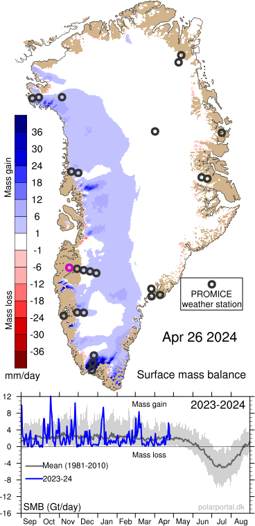
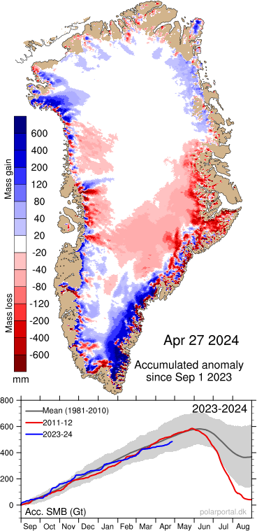
Day-to-day development of the Greenland Ice Sheet with the weather


The Greenland Ice Sheet evolves throughout the year as weather conditions change. Precipitation increases the mass of the ice sheet, whilst greater warmth leads to melting, which causes it to lose mass. The term surface mass balance is used to describe the isolated gain and loss of mass of the surface of the ice sheet – excluding the mass that is lost when glaciers calve off icebergs and melt as they come into contact with warm seawater.

The figures above are updated on a daily basis and show how much mass in terms of snow, ice or water is lost or gained on the surface of the Ice Sheet.

The black circles on the map correspond to the PROMICE meteorological stations that have been established to monitor the melting processes. Note that the circles on the map are slightly displaced from their actual positions in order for them to be distinguishable. On the large version of the map they are marked with small dots at their true positions. By clicking on the magenta circle, measurements of runoff from Watson river close to Kangerlussuaq is shown. The river drains about 12000 km2 of the inland ice.

The density of snow and ice is different to that of water, and the figures are therefore converted to water to ensure that the total mass is calculated.


The model on which “Daily change” and “Accumulated” are based


The figures are based in part on observations made by meteorological stations on the ice sheet and in part on DMI's research weather model for Greenland, Hirlam-Newsnow, and since 1 July 2017 the HARMONIE-AROME weather model. This data is used in a model that can calculate the total amounts of ice and snow. Snowfall, melting of snow and bare ice, refreezing of melt water and snow that evaporates without melting first (sublimation) are all taken into account in this model.

The model was enhanced in 2014 to take into account the fact that some of the melt water refreezes in the snow, and again in 2015 in order to also take into account the low reflection of sunlight on bare ice compared to snow. Finally, it has been updated again in 2017 with a more advanced representation of percolation and refreezing of meltwater. At the same time, we have extended the reference period to 1981-2010. The update means that the new maps, figures and graphs will deviate from previous examples that can be seen in earlier season reports. Everything that appears on this page, however, is calculated using the same model, such that all graphs and values are directly comparable.

Data from the meteorological stations may be missing due to problems with instruments or transmissions via satellite if the power of the solar-powered battery is low or if the meteorological station is covered in snow, or, in the worst case, has toppled over.

More information:

PROMICE

This year's data for the total contribution can be downloaded here. Please make sure that you read the disclaimer at the top of the file!

Surface mass balance and other model output from DMI's regional climate model HIRHAM5 as shown on the daily surface mass balance page is freely available for research purposes from the DMI research department. A selection of variables for the ERA-Interim period and future simulations driven by EC-Earth can be downloaded here. These simulations are documented in scientific publications by Langen et al. (2017) and Mottram et al. (2017).

The HIRLAM weather model

The HARMONIE-AROME weather model that since 1 July 2017 drives the melt model

How much light is reflected from the Greenland Ice Sheet?


The proportion of light that is reflected from the Greenland Ice Sheet is also known as the albedo.

Freshly fallen snow is very bright and reflects most of the sunlight that hits it. The snow becomes darker when it is warmed up or has been lying on the ground for a while. Dark areas absorb more energy from the sun, which leads to further warming and melting of ice. Changes in reflectivity are thus amplified via a positive feedback loop.

The red areas of the map indicate where the surface of the ice has become darker. This can be due to melting and in certain cases due to particles that have precipitated from distant forest fires, for example. Blue areas show where the surface of the ice has become lighter. This can be due to freshly fallen snow or perhaps simply more snow than normal.

The albedo provides a convenient indicator of the competing effects: ice mass gain from snowfall and ice mass loss from melting. Ice that melts is darker (has a lower albedo) because the melting process makes the ice crystals more rounded in shape, in addition to which the melt water also reduces the reflectivity of the snow and ice.

The albedo is thus a very sensitive climate indicator.

The map is based on NASA’s satellite measurements from the MODIS sensor, which measures the reflection of sunlight from the surface. The map is updated on a weekly basis. These measurements cannot be carried out during the winter season due to the lack of sunlight.

More information:

NASA MODIS

How to determine the snowline


The snowline is defined as the maximum elevation during the melt season where snow from the previous accumulation season remains (Cogley et al., 2011).

The snowline is a valuable climate indicator as its position integrates the competing effects of melt (increasing snowline elevation) and snow accumulation (decreasing snowline elevation). Thus snowline provides a key holistic variable indicating climate change.

The figure illustrates the location of remotely-sensed snowline plotted on top of the digital elevation model (DEM) from the Greenland Mapping Project (GIMP, Howat et al. (2014). The snowline is easily visible in the southern, western, and northern part of Greenland due to the relatively even terrain, while the snowline shows a more complicated pattern in mountainous East Greenland.

We developed a methodology that determines snowline elevation utilizing the moderate-resolution imaging spectroradiometer (MODIS) sensor on the Terra satellite. The MODIS sensor produces a global dataset on a daily basis, with a resolution varying between 250 m and 1 km, in 36 bands covering visible to thermal wavelengths.

We use normalized thresholds between visible and thermal wavelengths to derive the maximum snow line altitude around Greenland for the years 2000-2017. For more information about the snowline product, see Fausto et al. (submitted).


The measurements of the discharge from Watson River are conducted approximately 25 km from the margin of the Greenland Ice Sheet, and 150 m from the bridge in Kangerlussuaq. Until 2013, the University of Copenhagen was in charge of the measurements. Since 2013, the Geological Survey of Denmark and Greenland has carried out the measurements. The discharge is measured every hour and the uncertainty is 15%. These high-resolution measurements are available on the PROMICE website. In the figure above, they have been converted to annual discharge.

In the absence of direct measurements of discharge from the Watson River, the discharge is reconstructed based on other measurement series from the local area. The first type of measurements is air temperature in Kangerlussuaq that has been measured since 1949 (red dots). Comparisons between air temperature and Watson River discharge in the period 2006-2017 revealed a clear correlation between higher air temperatures and more discharge. This correlation can be used to calculate the discharge back in time.

The second type of measurements is the discharge from neighbouring Tasersiaq Lake (yellow dots). Similar to Watson River, the water in Tasersiaq Lake comes from the ice sheet. The discharge from the lake has been measured every three hours since 1979 and daily between 1975 and 1979. Those measurements can then be converted to annual discharge. Just like the air temperature, there is a clear correlation between discharge from Tasersiaq Lake and Watson River. This correlation is also used to calculate the discharge back in time.


Additional information


Van As et al. (2018): Greenland Ice Sheet meltwater discharge through the Watson River (1949–2017). Arctic, Antarctic, and Alpine Research 50, doi: 10.1080/15230430.2018.1433799.

PROMICE

van As et al. (2017): Hypsometric amplification and routing moderation of Greenland ice sheet meltwater release. The Cryosphere 11:1371–1386, doi: 10.5194/tc-11-1371-2017.